The Real Problem: Too Many SKUs, No Strategy
Why Volume Without Structure Kills Sales
Walking into a cosmetics store with 900 SKUs sounds like a strength, but in execution, it usually creates confusion. When every product is given equal importance, nothing stands out. Shelves become overcrowded, customers feel overwhelmed, and the shopping experience turns into effort instead of discovery.
What I Saw Walking Into the Store
In this project, the store carried close to 900 to 1000 SKUs within roughly 150 square meters. The inventory was there, but the structure wasn’t. Products were placed without a clear hierarchy, categories blended together, and key items were getting lost in the mix. The store didn’t have a selling problem—it had an execution problem.
Fixing the First 7 Seconds of the Store
Rebuilding the Entrance Experience
The first few seconds inside a store determine whether a customer engages or disconnects. This location lacked direction at the entrance. There was no decompression zone and no clear starting point, which made the space feel cluttered immediately.
Creating a Visual Anchor That Pulls Customers In
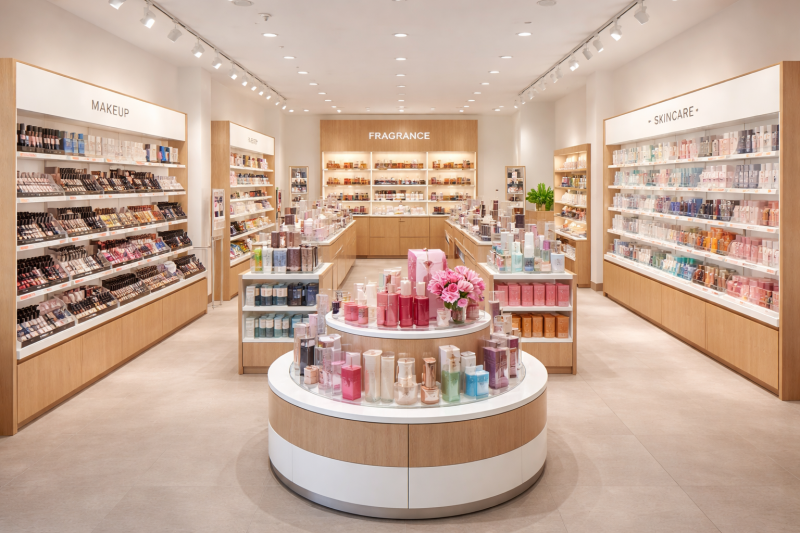
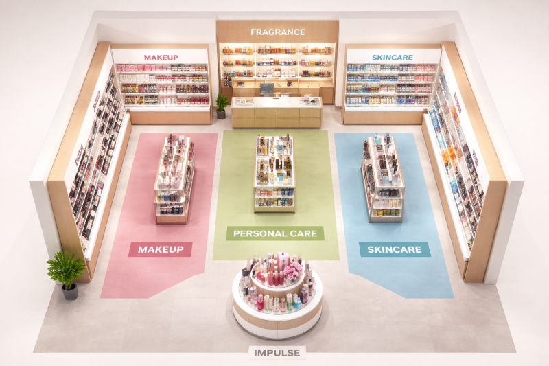
I introduced a controlled entry flow, anchored by a round promotional display placed just beyond the entrance. This became the focal point of the store. By placing premium and giftable items at eye level, supported by impulse products in the mid-sections, the display transformed into a high-conversion zone rather than just another fixture.
Category Zoning: The Foundation of the Layout
Separating Cosmetics, Fragrance, and Personal Care
The biggest shift came from reorganizing the store into clear zones. Cosmetics were positioned along the main walls to create a strong visual identity. Fragrances were placed near the register, improving both security and last-minute purchasing. Personal care categories were moved to central gondolas, forming a natural path through the store.
Turning the Store Into a Guided Shopping Experience
Instead of forcing customers to search, the layout began guiding them. The zoning created a logical progression through categories, making the store easier to navigate while increasing exposure to more products along the way.
Merchandising Priority: Not Every SKU Deserves Space
Identifying High-Volume and High-Margin Products
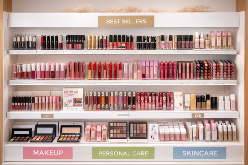
One of the most common issues in high-SKU stores is treating every product equally. I introduced a priority system that elevated high-performing items into the most visible positions. This ensured that bestsellers and high-margin products were leading the shelf, not getting buried.
Creating Breathing Room on the Shelf
By reducing overcrowding and giving key items more space, the shelves became easier to shop. The store didn’t need more inventory—it needed clarity. Once that clarity was created, the overall presentation immediately felt more premium.
Customer Flow and Movement Strategy
Guiding Traffic Through Central Gondolas
The original layout didn’t control how customers moved. By repositioning gondolas and aligning them with the zoning strategy, the store began to naturally direct traffic through key areas. Customers were no longer cutting straight across the space—they were engaging with it.
Using Layout to Increase Dwell Time
The new flow encouraged browsing rather than quick exits. Central fixtures became engagement zones instead of obstacles, increasing the time customers spent interacting with products.
The Stockroom Strategy Most Stores Ignore
Why Everything Shouldn’t Be on the Floor
Another major issue was overloading the sales floor. Trying to display all 900 SKUs at once created visual noise and reduced the impact of each product.
Using Backstock to Support Sales, Not Hurt Them
I shifted part of the inventory strategy to controlled backstock. High-performing items remained easily replenishable, while lower-priority products were rotated strategically. This maintained availability without sacrificing presentation.
Visibility, Sightlines, and Store Clarity
Opening Up the Store Without Changing Fixtures
The store originally felt tight because fixtures blocked sightlines. By adjusting positioning and spacing, I created clearer visibility from the entrance to key areas. This made the space feel larger without adding or removing fixtures.
Making It Easy for Customers to Navigate
Once sightlines improved, the store became more intuitive. Customers could immediately understand where categories were located, which reduced friction and made the experience smoother.
Final Result: From Cluttered Store to Conversion Machine
What Actually Changed After the Reset
The transformation wasn’t about adding more. It was about refining what was already there. The store became cleaner, easier to shop, and more focused on high-impact products.
Why Execution Always Beats Inventory Volume
A 900 SKU cosmetics store doesn’t struggle because of inventory size. It struggles when that inventory isn’t working strategically. Once layout, zoning, and merchandising priorities are aligned, the entire store begins to perform differently.
That’s where most retailers are missing the opportunity.
Add comment
Comments