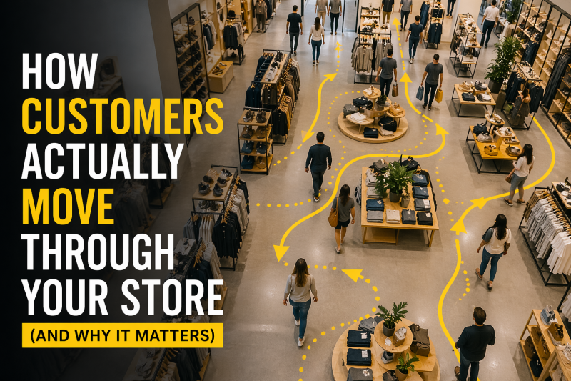
Most retailers believe customers move through their store in a logical, structured way. The assumption is simple: a shopper walks in, browses each section, compares products, and eventually makes a purchase. In reality, that’s not how it works. Customer movement is far more instinctive, selective, and influenced by the environment than most store owners realize. And if you don’t understand how people actually move, you’re leaving sales up to chance.
The moment a customer walks into your store, the shopping experience has already started—but not in the way most people think. The first few steps inside are what’s known as the decompression zone. This is a short transition space where customers adjust from the outside world to your store environment. During this phase, their attention is not fully engaged. They’re not analyzing products, reading signs, or making purchase decisions. They’re simply orienting themselves. This is why placing important signage, promotions, or high-margin items right at the entrance often fails. Customers aren’t ignoring those displays intentionally—they’re just not ready to process them yet.
Once customers move past that initial zone, their behavior becomes more predictable. In the United States, shoppers naturally drift to the right after entering a store. This pattern has been consistently observed across retail environments, from grocery stores to apparel chains. It’s influenced by everyday habits like driving and walking patterns, which subconsciously guide movement. This makes the front-right section of your store one of the most valuable areas for influencing buying decisions. If you’re placing low-priority products there, you’re wasting one of the strongest opportunities in your entire layout.
As customers move deeper into the store, they don’t explore evenly. They follow paths that feel intuitive, and those paths are shaped by your layout. Wide, clear walkways encourage forward movement, while tight, cluttered spaces create friction. When customers encounter congestion or confusion, they speed up or skip sections entirely. This isn’t a matter of preference—it’s behavioral. Studies in retail environments show that shoppers are far less likely to engage in areas that feel difficult to navigate. Even small layout issues, like poorly positioned fixtures or blocked sightlines, can disrupt flow and reduce product exposure.
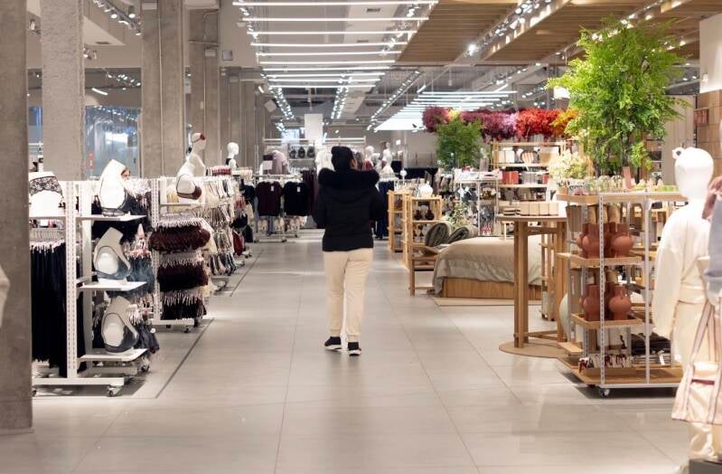
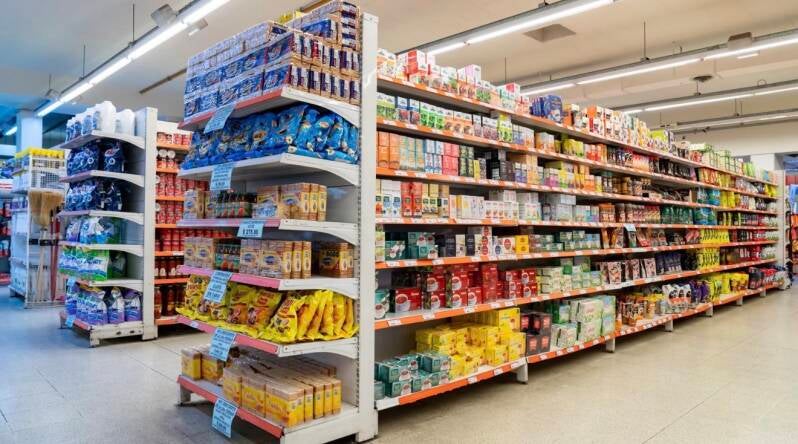
Visibility plays a massive role in how customers interact with your store. People don’t shop every shelf—they scan. If something doesn’t immediately catch their attention or clearly communicate its value, it gets ignored. Eye-level placement continues to be one of the most effective ways to increase product interaction, but visibility goes beyond shelf height. It’s about how quickly a customer can understand a section. If a shopper can’t grasp what a display offers within a few seconds, they move on. This is why overstocked or visually cluttered shelves often perform worse than clean, well-structured ones. More product doesn’t mean more sales—clear presentation does.
As customers move, they naturally create stopping points throughout the store. These stop zones typically occur at transitions—endcaps, intersections, or areas where the path changes direction. These moments are critical because they combine visibility with pause. When a customer slows down or stops, their likelihood of engaging with a product increases significantly. This is where impulse purchases happen and where high-margin items should be positioned. Stores that strategically use these zones consistently outperform those that treat all areas equally.
At the same time, every store has areas where customers barely spend time. These are your dead zones. They’re often located in back corners, behind obstacles, or in sections that lack clear purpose or visibility. Many retailers respond by placing excess inventory or low-performing products in these areas, which only makes the problem worse. The issue isn’t always the product—it’s the lack of traffic and engagement. Fixing a dead zone usually requires improving flow, visibility, or lighting rather than simply changing what’s on the shelf.
Another key factor in customer movement is navigation. If a store feels confusing or overwhelming, customers don’t take the time to figure it out—they leave. Clear pathways, logical category grouping, and strong visual hierarchy reduce cognitive load and make shopping easier. When customers can quickly understand where they are and where they need to go, they’re more likely to stay longer and explore more. Data across multiple retail formats shows that stores with intuitive layouts see higher conversion rates because they remove friction from the shopping experience.
Movement through a store also isn’t consistent. Customers naturally speed up and slow down depending on what they encounter. They move quickly through areas that feel irrelevant or uncomfortable and slow down in areas that capture their interest. This creates a rhythm within your store—fast zones and slow zones. Understanding this rhythm allows you to design your layout more strategically. High-interest, high-margin products should be placed in areas where customers naturally slow down, while transition areas should be optimized to guide movement rather than disrupt it.
What makes all of this powerful is that it’s measurable. Retailers today have access to tools like heat mapping, traffic tracking, and in-store analytics that show exactly how customers move. But even without advanced tools, simple observation can reveal patterns. You’ll start to notice which areas customers avoid, where they pause, and how they navigate the space. Most stores are surprised to discover that large portions of their floor receive minimal attention. Adjusting layout based on these insights often leads to immediate improvements in engagement and sales without needing more inventory or promotions.
At its core, customer movement is driven by psychology, not intention. People don’t consciously decide to ignore certain areas or rush through sections—it happens automatically based on how the environment is structured. Stores that align their layout with these natural behaviors create a smoother, more engaging experience. Stores that ignore them rely on luck, hoping customers will interact with products they may never even see.
When you start viewing your store through the lens of movement, everything changes. Your layout becomes more than just a way to display products—it becomes a system that guides behavior. Every aisle, every fixture, and every display either supports that system or works against it. And in a retail environment where attention is limited and competition is high, the difference between those two outcomes is often what separates stores that convert from those that don’t.
Understanding how customers actually move through your store isn’t just useful—it’s essential. Because at the end of the day, customers can only buy what they experience. And if your layout isn’t guiding that experience effectively, you’re not maximizing what your store is capable of doing.
Add comment
Comments